
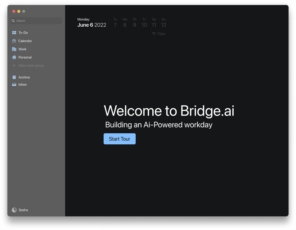
Bridge.ai
TEAM
1 Project Manager • 4 UX/UI Designers (including me as Team Lead) • 2 Client-side Developers
PROJECT DURATION
8 Weeks
MY ROLE
Lead UX/UI Designer (Discovery • Research • UI Design • User Testing • Developer Synthesis)
TOOLS
Figma, Zoom, Slack
TLDR:
Designing a desktop productivity app that uses machine learning to help users manage tasks more efficiently, automate repetitive workflows, and reclaim focus.
→ Project Overview
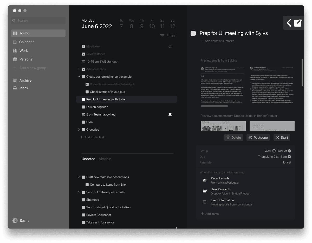
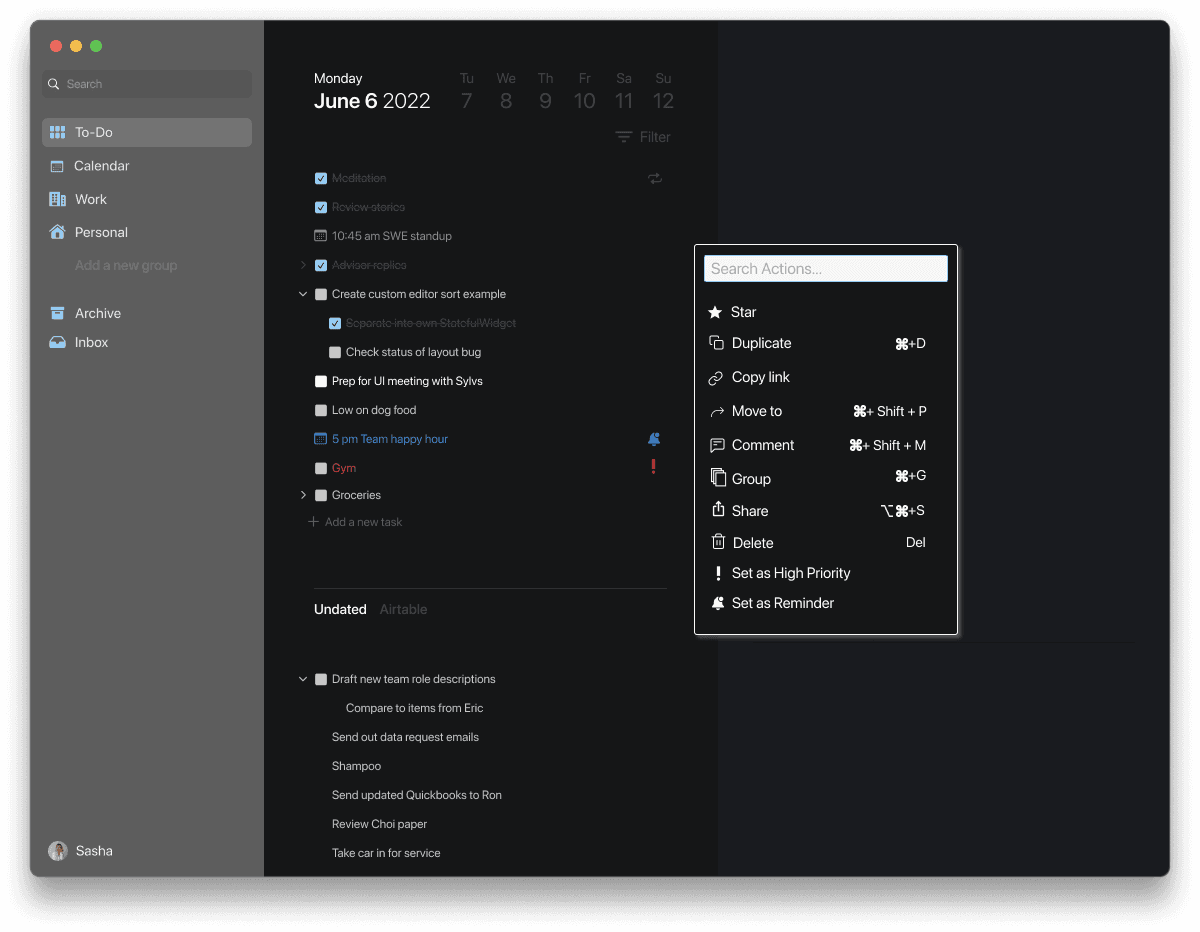
Bridge.ai is a macOS desktop productivity tool that leverages artificial intelligence to interpret and organize users’ to-do lists. Acting as both a text editor and intelligent assistant, the platform helps users simplify task management through automation, app integrations, and nested task structures, all within a distraction-free interface.
As Lead UX/UI Designer, I collaborated with a cross-functional team to translate the client’s early design draft into a cohesive macOS experience aligned with Apple’s Human Interface Guidelines.
Problem Statement
•
Traditional to-do lists help users track work, but not do it. Most productivity tools become cluttered, leaving users overwhelmed with endless lists and scattered apps.
We aimed to design an intelligent, minimal workspace that helps users focus on what matters most by using AI to automate and simplify routine tasks.
How might we design an intelligent, minimal workspace that reduces cognitive load, automates routine tasks, and helps users focus on meaningful work instead of managing endless to-do lists?
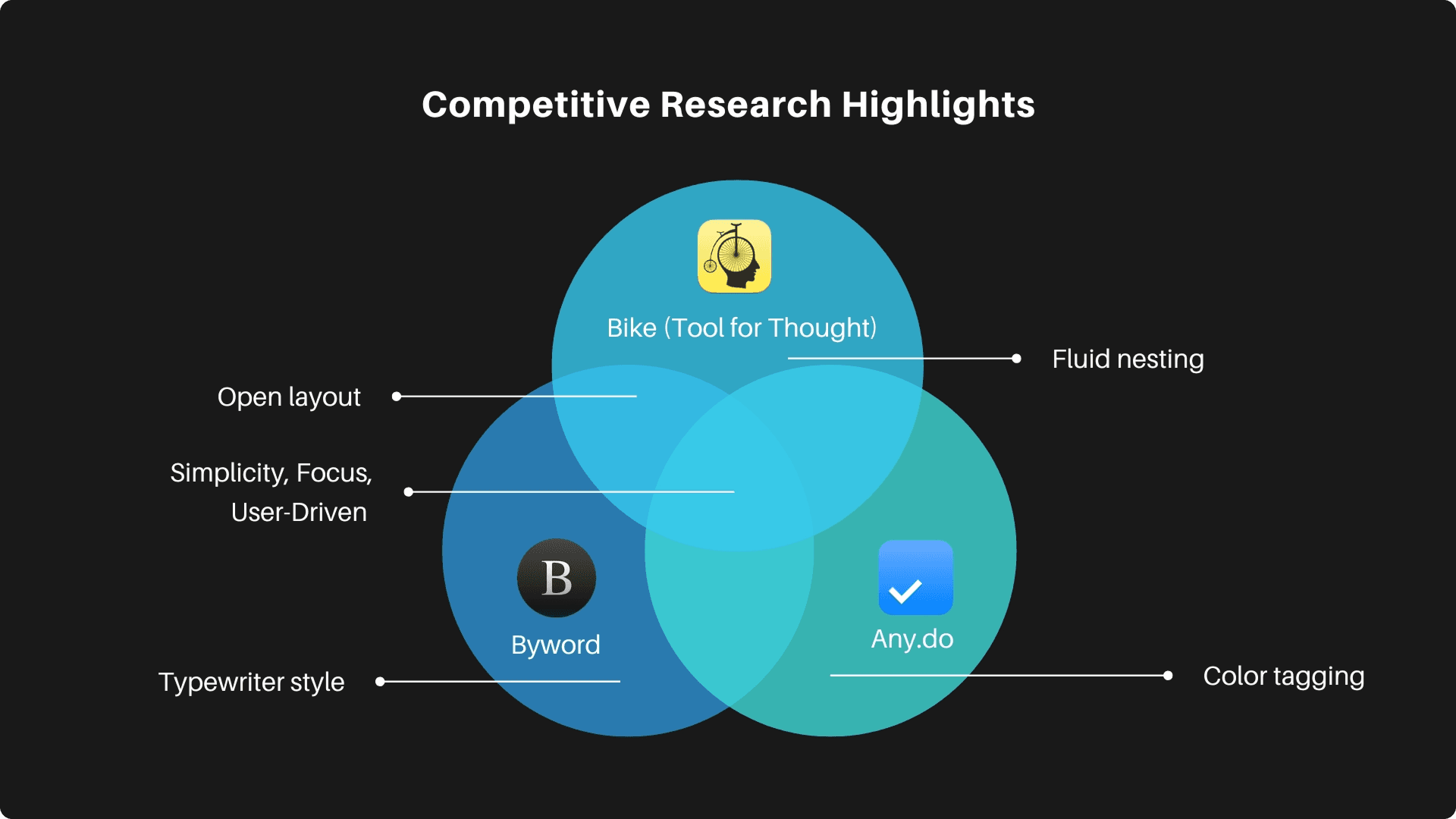
Tackling the Problem
•
SMART CANVAS EXPERIENCE (INITIAL DIRECTION)
Before receiving updated client constraints, our team explored a text-first smart canvas that allowed users to write, nest, and reorganize tasks in a natural, flexible way. This helped us understand how a minimal workspace could support focus, and guided decisions around spacing, hierarchy, and visual rhythm.
Although this direction did not move forward after learning the client already had an internal version of the canvas, the initial direction was helpful and informed how we approached later interaction patterns.
AI-Assisted Productivity
Explored lightweight shortcut commands to automate routine tasks. These commands introduced early AI capabilities without overwhelming users or disrupting the simplicity of the workspace.
01
DISCOVER
Getting started…
EXPLORING THE PRODUCTIVITY SPACE AND USER WORKFLOWS
To form a strong base, our team began by analyzing how users currently manage their daily tasks across popular productivity tools. We also reviewed the client’s early design draft to clarify the project scope and expectations. This helped us pinpoint where Bridge.ai could bridge existing gaps which meant offering a more intuitive, AI-assisted way to organize, prioritize, and complete work.
Defining user needs...
USER STORIES TO GUIDE CORE FEATURES
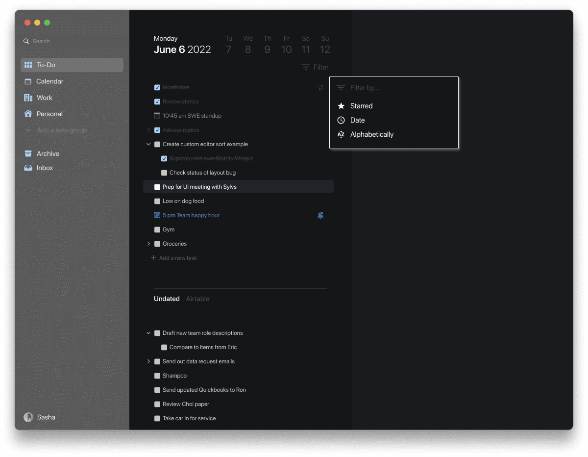
To align the product with real task behaviors, we created user stories and prioritized them into high, medium, and low levels. My focus centered on the canvas, sorting options, and user flow clarity.
Key user stories included:
As a user, I want to quickly capture tasks so I can stay focused.
As a user, I want to nest and reorganize tasks so I can manage priorities.
As a user, I want shortcuts or commands so I can complete actions faster.
As a user, I want the interface to feel simple and familiar so I can navigate easily.
02
IDEATE AND DESIGN
Designing for flow and focus...
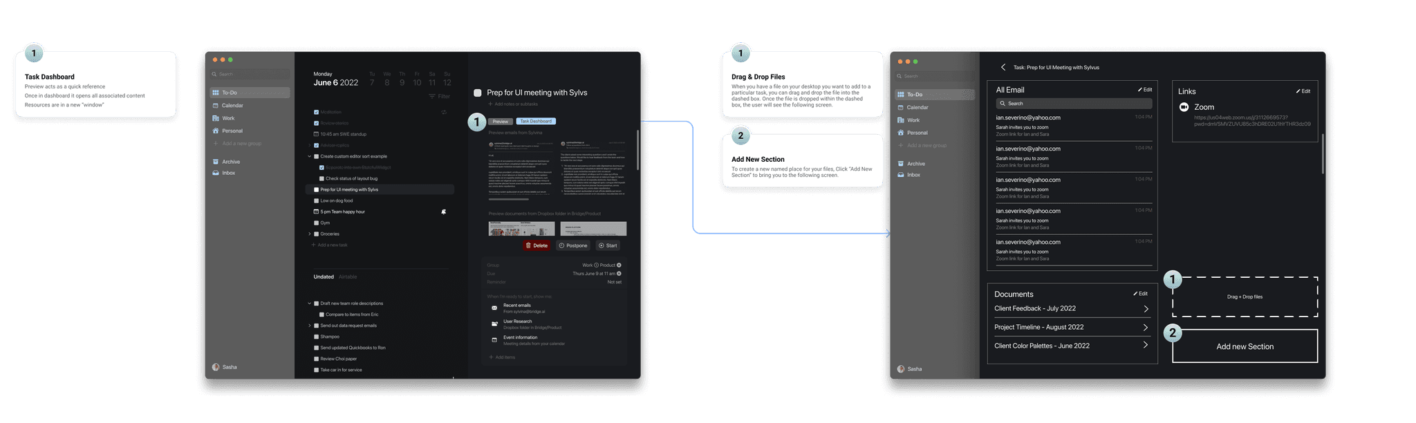
EARLY STRUCTURE AND TASK FLOWS
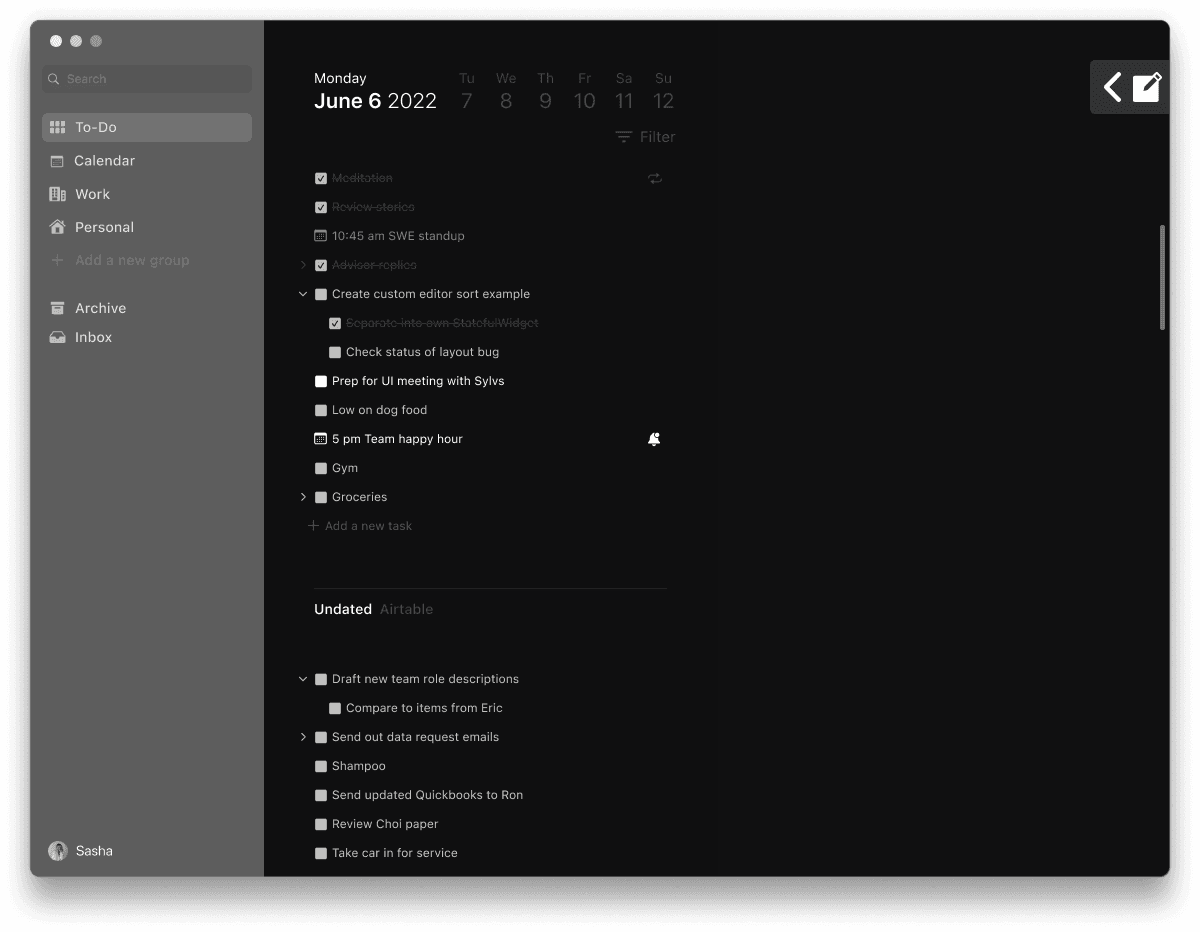
Our initial wireframes included both the smart-canvas concepts and the features the client requested. Once we learned the canvas already existed internally, we pivoted to improve the components that required design attention, such as sorting options, panel layouts, and navigation patterns aligned with macOS.
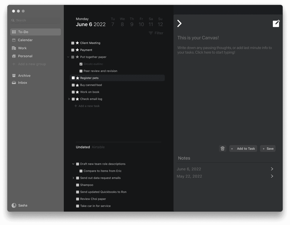
Early canvas exploration
Early concept exploring a text-first task workspace.
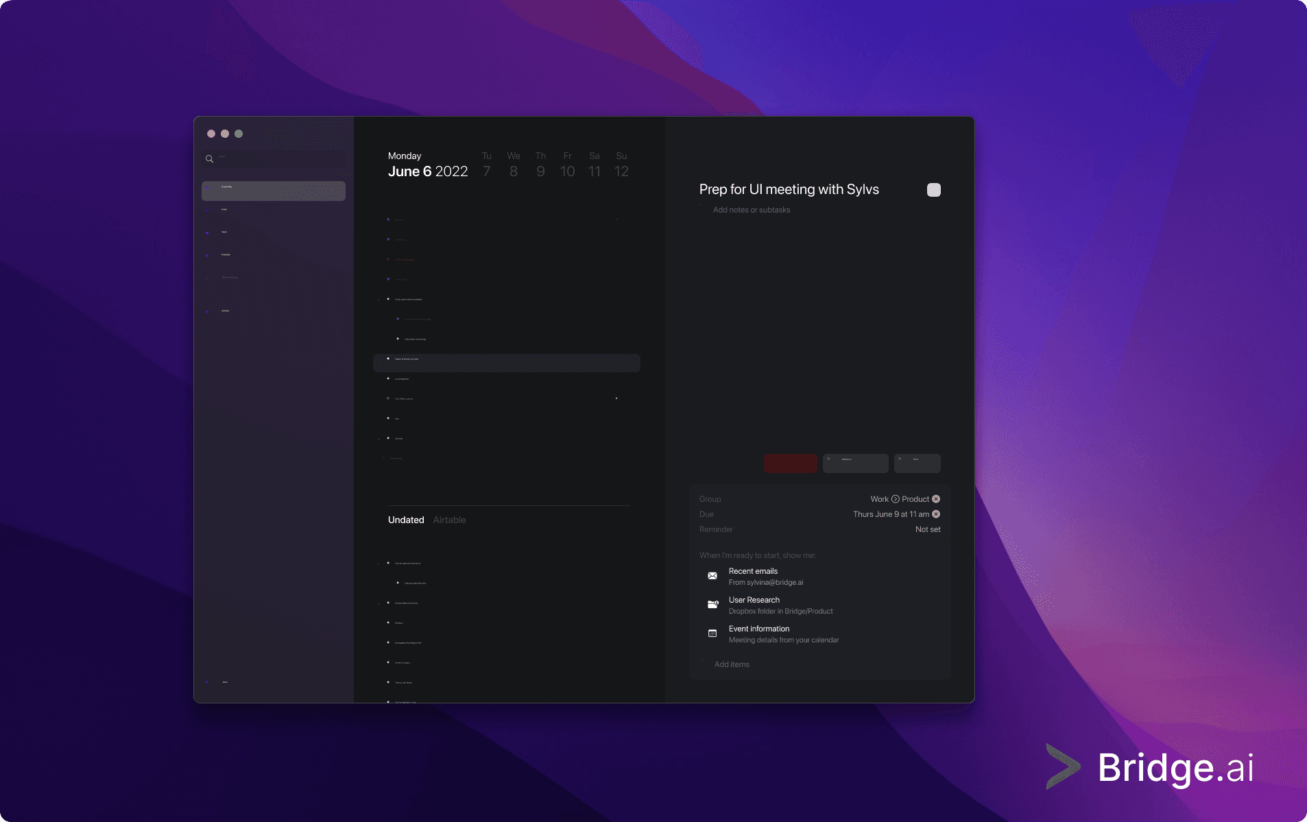
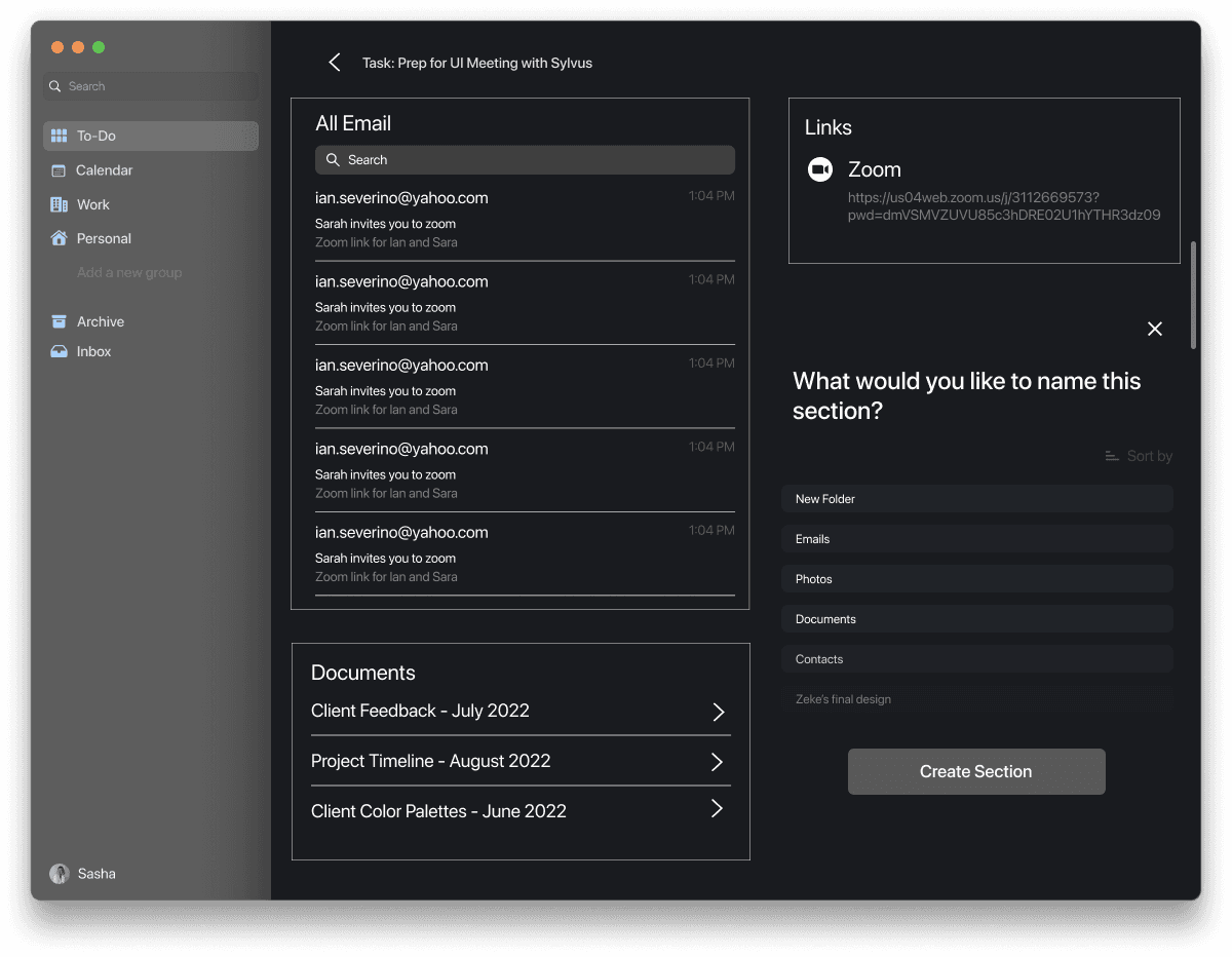
Task preview mockup
Refined preview layout showing task details and supporting information.
Feedback and refinement
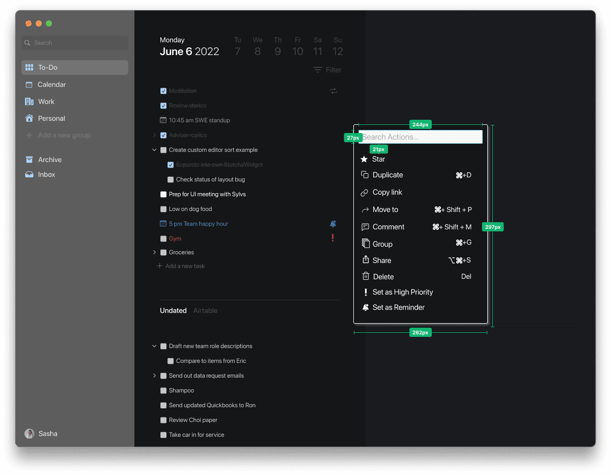
ITERATING ON INTERACTION PATTERNS
After presenting wireframes to the client, we redesigned core interactions to improve clarity and usability:
Simplified task hierarchy and indentation behavior
Adjusted shortcut placement for easier visibility
Removed redundant screens already present in the client build
Streamlined navigation to focus on core workspace functions
Updated spacing and typography for readability
03
FINAL DESIGN & DEVELOPER HANDOFF
Time to put the design to the test
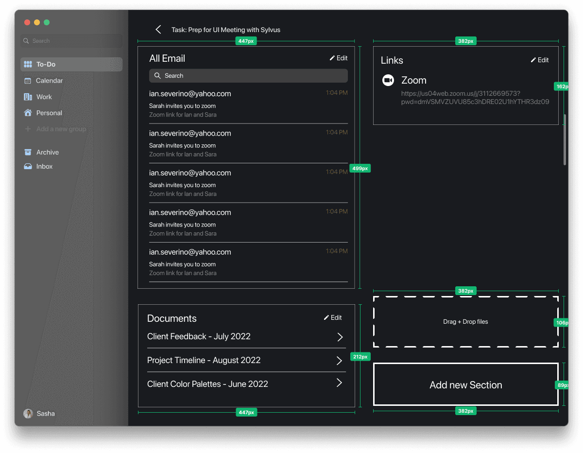
FINALIZING THE VISUAL DIRECTION
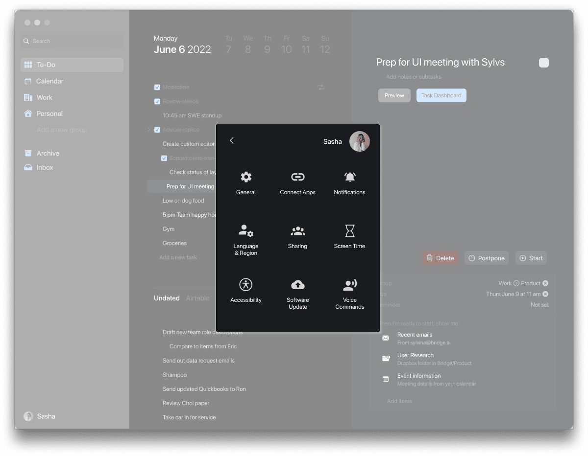
Our high-fidelity designs followed macOS Human Interface Guidelines to keep the interface familiar and intuitive, while adding subtle brand personality through accent colors, button styling, and lightweight graphics. After finalizing the visuals, I created annotations, spacing specs, and interaction notes for the client’s development team to deliver a smooth and accurate handoff.
04
REFLECTION
Looking back...
DESIGNING FOR CLARITY AND FOCUS
Designing Bridge.ai was a highly exploratory process. With the product still evolving, our team had to make quick decisions, validate assumptions, and pivot when we learned the smart canvas was already built internally. This taught me the importance of early alignment and asking the right clarifying questions before moving onto deeper iterations.
KEY LESSONS LEARNED
Aligning on existing components early prevents unnecessary design work. Well-organized annotations and spacing specs make engineering handoff smoother, even in conceptual projects.
WHAT I'D DO DIFFERENTLY
Clarify technical constraints earlier, and validate assumptions faster with low-fidelity prototypes or client workshops.
NEXT STEPS & IMPACT
Our work helped the client better understand which features were essential, reducing ambiguity and supporting their later strategic pivot.